When I was a child, I liked to draw maps. Even at an early age, I understood there was something powerful about the ability to render graphic representations of spatial relationships on paper. From memory, I drew maps of the United States of America. It didn’t take me long to realise that if you memorised the big ticket contours (the point of Maine, the rough bulge of the mid-Atlantic, the curve and hook of Texas…) you could supplement this rough shape with random but detailed ‘squiggles’ that would approximate the twists and turns of the actual coastline.
To the casual eye, the map would look much more accurate that way. I recall some of my teachers’ reactions to these visually appealing, detailed maps of the US which decorated the blank pages of my phonics workbooks – they took me for some kind of prodigy. Of course, if you were to compare the detailed squiggles with the actual contours of the coast, there would be no more overlap than what chance might throw up – after all, I improvised the squiggles randomly. But it didn’t matter, the pretense of detailed knowledge was enough to convince most people that the map was far more accurate than it really was.
Would that this little deception remained in the workbooks of a 1980s schoolboy. Alas, this technique of pretending detailed knowledge has since gone mainstream. It defines ‘the Science’ behind a great many, drastic policy choices that are being implemented at this very moment.
Consider the Imperial College Model developed by Neil Ferguson, and which was adopted and copied to provide justification for draconian lockdown policies across the globe. The ‘model’ is very detailed and provides point estimates to a high degree of specification on how different policy choices would impact mortality as the pandemic progressed. The problem, of course, is that these estimates fell well outside the confidence intervals that should have been attached to them. If the fake squiggles had not been included in the model, the real answer would have been ‘we simply don’t know how many lives could be saved from locking down’.
Now, three years later, we can compare the fake Imperial College map with the actual evidence and we see how wrong they got it. Estimates for how many deaths would arise in the absence of lockdown were at least an order of magnitude wrong.
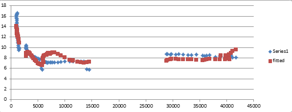
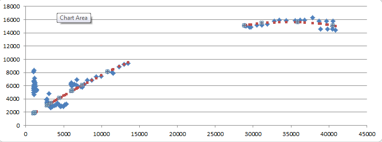
The same trick is being used to justify unprecedented changes in energy policy. Point estimates are being provided for the relationship between greenhouse gas emissions and increases in surface air temperature, with a degree of precision that completely belies the actual level of confidence ‘the Science’ could have in these numbers. In fact, as I argued previously, it is not possible to know whether the changes in climate the Earth is currently experiencing are at all the result of an increased concentration of GHGs in the atmosphere, because the two bigger causes of atmospheric heat – solar irradiation and albedo – cannot be measured with the requisite degree of accuracy, much less do scientists have any idea of the dynamic interaction between the three effects.
Of course, the really big problem with the pretense of detailed knowledge is that it acts as an obstacle to the pursuit of real knowledge. Once I became adept at faking coastal squiggles, I stopped looking carefully at the outline of the actual Atlantic / Pacific coasts, because to do so would jeopardise the professed accuracy of the maps I already drew. The same is true for climate science. No one is spending time and money to figure out whether the intensity or composition of solar energy is changing in a way that would impact the climate, because the question has already been answered, and the Science is not a very humble religious institution.
The question now facing us is whether we, as a civilisation, are prepared to do better than a bored 8-year old sitting at the back of the class.