If you know me or have visited this blog before, you’ll know that my book, The Hydra, is about overpopulation. In it, a scientist decides the world is so full of humans, that he must save the planet by engineering and releasing an infertility virus. I won’t give away too much of the plot, but suffice it to say as a novel it doesn’t really do much hard number crunching. It begs -but perhaps never really comprehensively answers- the crucial question: Is the world so overpopulated that we’ll destroy the planet unless we change our policy direction?
Indeed, when you discuss the issue with most people, you get lots of uninformed opinions, which range from “I think we’re all doomed, unless there’s some major war or something” to “There are definitely not too many people in the world. It’s just a question of sharing out the world’s resources fairly and investing in technology instead of war” I always find it astounding just how convinced both sides can be of their opinions, without the faintest notion of what the hard numbers are saying.
So let’s see if we can do any better. First stop, the databank of the World Bank where, after some data cleaning, we can come up with a list of useful data for the world’s countries, grouped into categories depending on how rich they are. Basically we’re looking at four things: population, Greenhouse Gas (GHG) emissions, GDP and birth/death rates, from 1960 to 2015.
What can we see from the numbers?
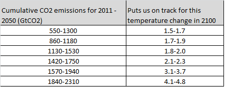
The first thing to look at is Greenhouse Gas (GHG) emissions. By 2012 we humans had pumped about 567 gigatonnes of CO2 equivalent (GtCO2) into the atmosphere since the dawn of industrialisation (1870). In 2012 alone we added 52 GtCO2 to this stock, up from an annual total of 27 in 1970. While the data are jumpy, on average, the amount of carbon we release in the atmosphere annually is growing by about 1.3% a year. Even if this pace of annual emissions growth were to fall from 1.3% to 0% a year, that would still mean we would be adding the 2012 payload of 52 GtCO2 into the atmosphere every year. If that level of emissions were to continue until 2050, that would result in an atmosphere laden with 2,572 GtCO2 released by humans. That number is so big, it is literally off the charts, as far as the climate scientists are concerned. To illustrate, I’ve made a simplified version of “the chart”, i.e. the UN’s reckoning of how cumulative emissions will raise temperatures. You can find the full chart on page 54 of this document.
As you can see, they don’t even consider a scenario in which we keep emitting the level of GHG which we emitted in 2012. What this is telling us is pretty clear: if we continue with business as usual, we’re going to miss the current climate targets by more than a factor of 2, resulting in massive, truly massive, changes to our climate which may well spell disaster for the planet and for us all. Now of course, nobody believes business as usual is an option, which is why we had Kyoto and then Paris and soon Marrakesh.
Linking emissions to income
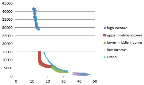
Money makes the world go round. And it also determines how much GHG we put into the atmosphere. Or more precisely, the things people like to spend money on: heat, bigger houses, clothes, high-protein food, transport. The precise link between income and emissions depends on where a person is on the income scale: For very rich countries, there is already evidence of ‘decoupling’, i.e. as rich people get richer, emissions don’t increase, they actually go down. But because rich countries only account for 15% of the world’s population, that doesn’t really matter. What matters are the middle income countries, places like China and Brazil, who make up 35% of the world’s population. The 2.6 billion people living in these countries have been getting richer since 1990, and whenever they’ve got their extra cash, they’ve burned it and pumped it into the atmosphere. Here’s the chart that shows it:
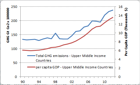
As these countries get to the sort of income levels the rich world has already achieved (and they are well on their way) there is every reason to assume that they too will ‘decouple’ emissions from growth, but for now, they are still hungering for more of the things that make the atmosphere hot: steak, cars, swimming pools and city breaks. And this is set to go on into the foreseeable future.
The real problem, though, is the next wave of countries, the so-called “Lower Middle Income” countries like India, which as a group are home to even more homo sapiens (2.8 billion or 40% of the world’s population). If these countries grow in the same way as China and Brazil have done, it will mean even more pressure to emit.
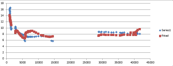
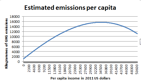
The power of econometrics can help us to estimate this relationship, which turns out to be very well approximated by the equation [kilograms of emissions / per person] = 1090 + (0.7093)*[GDP/person] – (0.0000047025)*[GDP/person]^2 – (0.00000000010531380)*[GDP/person]^3. If you want the nerdy details of where I got this, click here, but for everyone else I’ll just summarise what this means: If you have zero income, you will still emit about 1,000 kg of CO2 equivalent into the atmosphere every year. Emissions go up at about a rate of 700 grams a year for every dollar of extra income you get, but this slows down as your income approaches $35,000 a year. After that, extra income leads to lower carbon emissions per year. Here’s what the graph looks like:
So what about population?
In 2015, there were 7.3 billion humans on Earth, more than ever before. This population increases about 1.2% a year, and while the rate of increase has been slowing since the late 1960s, it hasn’t been slowing by very much. If the pace of population increase we have observed since 1969 were to continue (i.e. let’s assume it continues slowing a bit every year, like it has been doing) there would be 9.75 billion of us by 2050. This, by the way, is the EXACT baseline estimate for the UN’s own population projects, but more about the UN’s numbers in a bit.
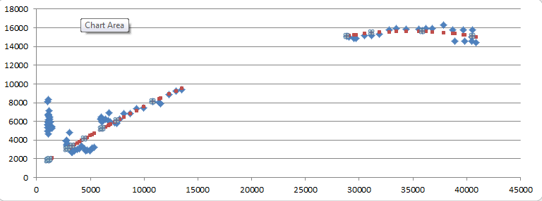
The main driver in the growth of populations is the crude birth rate, which measures how many children are born per 1,000 people. It turns out there’s a pretty stable relationship between birth rates and per capita GDP. Crude birth rates have been going down pretty much everywhere in the world, and it’s because of money. Basically, the richer a country, the fewer babies they make. In very poor countries, crude birth rates are around 35-40; as a country gets richer, the birth rate falls to just under 10. Figure X illustrates the relationship, which mathematically can be approximated by this formula: b = (45 * minY^a)/Y^a, where b = birth rate, Y is per capita GDP, and a is a “shape parameter” which is somewhere in the range of 0.2622 to 0.36487 Again, for the nerds out there, all the details are here.
The other thing that affects population is the death rate (deaths per 1,000 population). This too is ultimately a function of cash, but the relationship’s a little trickier because of demographic effects. (For example, Germany’s death rate is higher than Zimbabwe’s, not because Mugabe has better health policies than Merkel, but because, when you break it down, old age is the single worst thing for your health, no matter how rich you are. And Germany simply has a lot more old people than Zimbabwe.)
But here again, statistics can come to our aid. We can isolate the effect of the demographics and when we do, we get a pretty similar relationship as with per capita income. This is the equation that tells the story: d = (minY^a)/Y^a * (1/AGE^g), where d = the death rate, minY is a constant equal to 1,011, Y is per capita GDP, AGE is the percentage of the population aged over 65 and a and g are shape parameters equal to 1.0144 and -2.0097 respectively. In other words, the richer a country’s people are, the lower its death rate. The more oldies are in a country’s population, the higher the death rate.
So to recap, as people get richer, they have fewer babies, but they also tend to live longer, and we can use statistics to estimate by how much this is so for every extra dollar of income they get.
Putting it all together
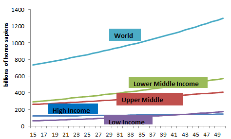
Equipped with the three sets of estimations we have done above, we are ready to put the whole picture together. The first step is to make an assumption about how per capita GDP might evolve in the future. Of course we don’t know, but let’s imagine it continues to grow at the same annual rate it has been growing from 1990 to 2015, for the four classes of countries the World Bank identifies: high income (e.g. the US and Europe), upper middle income (e.g. Russia, China and Brazil), lower middle income (e.g. India and Indonesia) and low income (i.e. mostly sub-saharan Africa). This is what we would get:
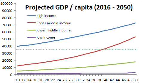
The dashed green line illustrates the ‘decoupling’ threshold, i.e. the point beyond which getting richer no longer causes more per capita emissions. As you can see, while the ‘Upper Middle Income’ countries pass this threshold, the ‘Lower Middle Income’ countries – and remember in population terms these are the big guys – won’t even have got there.
Using our equations which we estimated above, let’s now link this assumed GDP/capita path to what we know about birth rates and death rates and see what that gives us for total population:
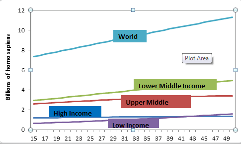
Now, there’s an awful lot to say about these “GDP driven” estimates of total population on earth. The first thing is that it gives us an estimate of 11.4 billion for the 2050 population, which is a good 1.7 billion more than the UN’s estimates. When you compare the two sets of projections line by line, you see that the differences are in the two “Middle Income” categories. The UN’s estimates seem to assume that these countries population’s will grow more slowly, driven by a faster decrease in birth rates.
The next major difference is that unlike the UN’s demographic projections, these GDP driven projections show no sign of population levelling off any time soon. Indeed, it seems to imply that for the bulk of countries, there’s a good ways to go until death rates overtake birth rates. (I’m willing to put my hands up and say I’m not a demographer, so maybe there’s things I have missed. For one thing, my modelling takes no account of migration trends. I guess I’m kind of assuming that for the world as a whole, net migration is zero. But as people move from poor to rich countries, their birth rates also change, so it’s possible to argue with my numbers).
Now you might be tempted to say: hang on, you just assumed GDP would grow like that. What if growth levels off? Wouldn’t that solve the problem?
Not really. If we change the model so that there is zero growth in per capita GDP from now until 2050 for all four classes of countries, here’s what we get:
Now the 2050 population is projected at a whopping 13 billion! This is because the lower per capita GDP among the ‘middle income’ countries is driving higher crude birth rates.
Finally, let’s bring this all back to total GHG emissions. If we plug these population numbers into our estimate for per capita GHG emissions by income level, we should be in a good position to tally up the total GHG emissions that this implies, under the two scenarios (no growth and growth at the average).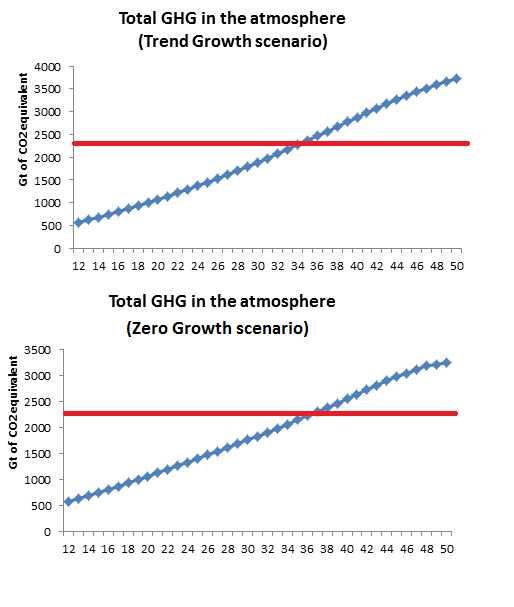
As you can see, with zero economic growth, the level of emissions is lower, but still really high. (The reason why it stays so high is because, at zero growth, although lower middle income countries like India are not pumping more GHG into the atmosphere, the rich and upper middle income countries still are. Furthermore, while the per capita emissions of the poor stays low, their numbers are increasing at a faster rate.)
For both graphs, the red line indicates the UN’s uppermost threshold (2,310 Gt CO2) for their most extreme emissions scenario. Therefore, the current projections put us on a path of GHG emissions that would mean temperature increases to 2100 of more than 4 degrees Celsius. Once again, well off the charts!
Can technology save our bacon?
It’s entirely possible that sometime next year, “they” will discover cold fusion, a carbon-less, virtually free and infinitely renewable energy source that will allow us to rapidly decarbonise and merrily turn the planet into some kind of Coruscant. I have no clue whether this is a realistic prospect.
But sadly, neither do the people who seem to be depending on it as a solution. And my instincts tell me it is very bad policy to rely on a solution not yet invented in order to solve a problem so grave that it threatens our species’ very existence.
Maybe the way to save our bacon is simply to stop eating it? Lowering our consumption of meat and other carbon intensive goods will surely help. Yet when we look at the scale of the challenge as outlined above, it is clear to me this can only be a part of the solution.
Given that the underlying problem is that there are a lot of people in the world, birth rates are higher than death rates, and most of the world’s poor are getting richer, it seems to me that – absent Cold Fusion – there are really only two other choices:
1) Keep the poor as they are: poor. Stop them from developing economically, so they can’t burn the CO2 which we, the rich folks, have been torching for decades now. Don’t let them have decent houses, clean water or high protein diets, because these things cost carbon, and we haven’t got it to spare. This solution would likely work but it seems to me to be highly immoral. I would hate to live in squalor, be hungry, or to not have healthcare. So I don’t want to espouse policies that depend on others having to live in a way I would not.
2) Move to a Global Single-child policy: The one-woman, one-child policy is the best way there is of controlling these effects. Policies which shift the birth rate equation down at all income levels are the ones most likely to achieve our environmental aims without having to inflict misery and suffering on our own species, or on others. It would take a policy step-shift in thinking to address these problems, but as far as I am concerned, when I look at the numbers, I am certain that this is the only reasonable policy solution there is. We can start by asking religious leaders like Pope Francis to change their messaging around birth control.
And, of course, we can stop thinking of demographic change in the West as a ‘problem’. It isn’t a problem, it’s the start of the only real solution.
NOTE: I am including the full set of data which I used to do all calculations. I welcome any corrections or suggestions for improving the model.